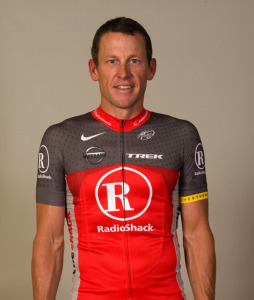
Pop artists and savvy, successful designers from Shepard Fairey to Marc Newson to pretty much everyone short of friggin’ Banksy have styled custom bikes for you and this—this—is the kit you get to ride in every day? I cannot imagine a more artless and uninspired piece of lycra.
It’s like someone took an overworked, underpaid corporate designer and told them to re-imagine a cubicle as a bicycle kit, employing three necessary elements:
- RadioShack Logo (w/ company name in Frutiger Black)
- Livestrong Armband
- RadioShack approved red (#C70E0E)
If Inintech had a cycling team, this would be their kit. Seriously, it ought to come with its own TPS report.
To be fair, Armstrong himself has commented that it still needs “some tweaking“, but plenty of other teams have brought strong entries to market. Cervelo’s new kit—along with some shiny new SRAM shifters—seems to be a done deal for next season, with the potential for another summer changeover to white.
Omega-Pharma’s new duds (via @Gematkinson) look a bit Christmasy, but the design should hold up throughout the season—though a glut of white-ish kits among the lower-tier squads (recently snared doper Eliado Jimenez shows off a good example) may make the Belgian squad tough to pick out until the final kilometers.
As for me, I continue to favor the classic, ugly/hip lines of Skil-Shimano’s distinctive kit. If the squad has kept pace with the rest of the peloton, and @KennyVanHummel is a reliable photo source, they’ll be sticking with the design for 2010.
Then again, as Cipo’ reminded us time and time again, there’s no telling what the riders will wear until they roll off the line.

I could not agree more… weak.
Meh.. The jersey is weak sauce.. They should have gotten a designer with some flair.. like one of the two geniuses at Twin Six (www.twinsix.com).. Just sayin’.. legal disclaimer, I am in no way affiliated with T6, I just know they could come up with something better than this flaccid attempt…
I have no design talent whatsoever and could come up with a better jersey. Sad, very sad.
On the plus side – it’s not white.
Please, please no more white shorts – did designers forget – when wet the white kits are see through? At least keep some strategic color on there, thank you very much.
That thing looks so friggin’ old.
The jersey is awful, too.
I like it.
Yo, bros. Here is the tweet from Team Radio Shack. Verbatim: “Sneak peak @teamradioshack’s new jersey. Still some tweaking to be done but here you go for now…” Likely translation: They got hardcore cycling fans to look. They are not going to wear it in races if people barf on it. They are looking for social media to provide feedback. They haven’t shown bibs, so they haven’t even designed those yet.
Do they do jerseys with RGB colors? I thought it was CMYK.
Its nice and plain. Remember that non cyclist think cyclist look like dicks in their bright green yellow red groos lycra team kits.
That’s a shocker, but it will sell heaps to the tasteless plebs. And that emaciated model ! Where’d they get him? I thought the fashion world had moved on from the pre-pubescent anorexic 14 old drug addict look. Tasteless!!!
double thumbs up Christian
I doubt anyone who reads this blog could be objective, and disregard their hatred/Rabid adoration of LA. I think it looks ok. There is some “tweaking” that could be done. But you never can really tell how well the kit will look until you see all of it.
I find it refreshing in an old school sort of way. I am tired of the Katusha, Omega-Pharma white with red and blue highlights motif that seems so popular with the pro-tour these days, not to mention the weak attempt for street cred from Columbia. I think solid colors are a refreshing throwback. Cervelo in its mostly black (or mostly white) kit, Euskatel in their orange. I thought the original solid blue Columbia jerseys were a breath of fresh air in the fashion challenged peloton (or even Jan in solid celeste). Think Molteni orange with a black panel across the chest with black arms. Yeah, now we’re talking.
This looks like my ’80s CB Ski coat.
Yeah, it’s austere to the point of boring, but (as kkhart, joe and LDR observe) cycling fashion these days could use a tweak in that direction. In fact, cycling aesthetics generally seem to be stuck in this mid-90s, chunky-baggy, more-is-more, letting-in-all-hang-out mindset.
Of course, it that jersey then gets paired with white shorts + a red widow’s peak in the bikini zone, it will all be for naught.
All I can say is the following: “Lance looks ripped!”
I bet they change it significantly.
Still 100% better looking than the ’09 white / blue / brown kits of Ag2r.
It is a bazillion times better than the Astana kit.
“Still 100% better looking than the ‘09 white / blue / brown kits of Ag2r” . . . which itself was 100% better looking than anything worn by Garmin ever.
Ugly my 12 year old could do better. How about a little retro love kit.
Now that we’ve got a view of the shorts, this kit is officially heinous:
https://www.cyclingnews.com/features/photos/radioshack-training-camp-sponsor-ride/97905
no, its going to look good!
in the rain or a major crash.
Hey, at least these guys will be easy to pick out when watching the race on tv…and yes, the Columbia faux-six-pack looks a lot worse – especially on cyclotourists who make the six-pack stand ‘out’.
ugh! red and grey shorts?! seriously?????